
By Contributing Editor for Hearth & Home Deborah Carducci
There is nothing more powerful in the interior design world than color. Even for the smallest budget (especially if you are DIY), the transformation of color can dramatically alter the ambiance of any room.
Let’s face it – we all could use a little change of scenery these days. After spending most of this year living, playing and now working from home, most of us are more than ready for a decorating refresh. Homeowners are looking for inspiration for their walls and quite frankly, I know my paint brush is always on standby.
Perhaps a hint of color will take away the blues? Or could a dose of blue give us the calm and peaceful feeling we are longing for? Many homeowners are now favoring soft, neutral tones for creating relaxing interior spaces. The visual interest story of a room is being re-written with sumptuous fabrics full of texture and carefree, quiet patterns helping to lessen our current stress levels by being a bit easier on the eyes.
Benjamin Moore offers a wide variety with their OC collection, a lovely palette of white colors. There are many options for warm and cool neutrals, easily labeled for you on their paint chips and fan decks. The fear of gray being too cold no longer exists. White Wisp (OC-54) is a warm gray I specify often as it creates a light, clean backdrop, and when paired with crisp white trim creates an interior of pure calm perfection. White Wisp works its background magic when used with the soft colors in nature like driftwood, sea glass, corals and yellows, and of course white and off-white. Deeper hues of navy and charcoal will stand out as the stars of your room while this discreet white/gray takes second stage.
Ice Mist (OC-67) offers a hint of cool blue or green, depending on your lighting and fabric colors in the room. This gentle pastel gives off the slightest hint of color, making it a perfect choice for a bedroom sanctuary or luxurious bathroom.
Horizon (OC-53) is a great option for a kitchen or family room. This attractive cool gray complements deep wood tones and finishes while coordinating rich granites or quartz countertops. Horizon harmonizes well with deep blues and grays as well as blue-based red tones for a welcoming palette.
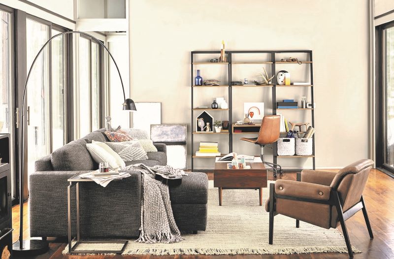
Still in doubt and confused by all of these gray options? Sherwin Williams Fleur de Sel (SW 7666) – which is the color of the room in the photo above – is one of my personal favorites. This hint of gray (or blue depending on your natural lighting) is the perfect choice for anyone who is gray-cautious. Fleur de Sel couples well with soft greens and blues harmonizing with your furnishings for a serene look.
A few more hints…
There is nothing “vanilla” about white. Sherwin Williams offers an expansive collection of white and pastel colors to explore. Mixing white and off white together with hints of colors will style an elegant and understated interior every time.
When beginning your project have fun and cast a wide net to expand your color reach for something new and different. I love to play with Sherwin Williams ColorSnap® Visualizer where you can either preview colors in pre-set rooms or upload a photo of your own. The possibilities are endless and allow you to visualize your color selection on your own walls with your lighting. Caution: you probably need to limit your screen time on this one! I’ve been known to get carried away for hours on end.
Once you narrow down to your favorite three or four color choices, get some samples to either paint areas on your wall or take advantage of the peel and stick swatches. Make sure to place sample colors on all four walls and look at them in daylight and evening.
Above all, enjoy the process and try not to make it a chore! Be happy, be safe and love to come home.

Interior Designer Deborah Carducci has spent over 20 years transforming primary and secondary residences and commercial office space throughout New England. Deborah says “good design starts with a great conversation.” She guides clients through the creative process from the initial consultation through design and installation. Her love of textiles, the influence of color, and creative design allow her to present a unique interior and experience for each client. Deborah also created Villa Lusso, a luxury brand of Italian inspired scented soy candles available through boutiques and her Etsy shop. Deborah recently published her first book (under her nom de plume, Angelina DiVersa), “It’s a Pillow, Not a Kidney” about an eager-to-please designer and her drama/comedy filled interior design business. Learn more at www.carduccidesigngroup.com and www.itsapillownotakidney.com